BackOffice revamp [back office redesign]
One customer panel. Consistent list pages.
- Role
- Design lead, prototypes built in code
- With
- Cata's engineers and testers
- At
- Cata, the platform behind 20 restaurant and retail brands
- Status
- Shipped
- Year
- 2026
Staff scrolled through seven tabs to see one customer. Now it is one panel, with the list still in view. Merchants also got clearer tables, less clutter, a simpler onboarding and dashboards that read at a glance.
- My role
- I designed the options, recommended the side panel and prototyped it in code. Engineers built it, and testers ran every test case.
- At a glance
- Side panel chosen over a full page and a summary view
- Prototyped in code before engineering built it
- Live for merchants
Three ways to fix it, then one choice.
A side panel, a full page and a summary view. I recommended the panel: the list stays in view.
A, side panel (recommended) B, full page C, summary and sections One look for every list.
Tabs, filters, table and status sit in one card, the same on every list page. Staff learn it once.
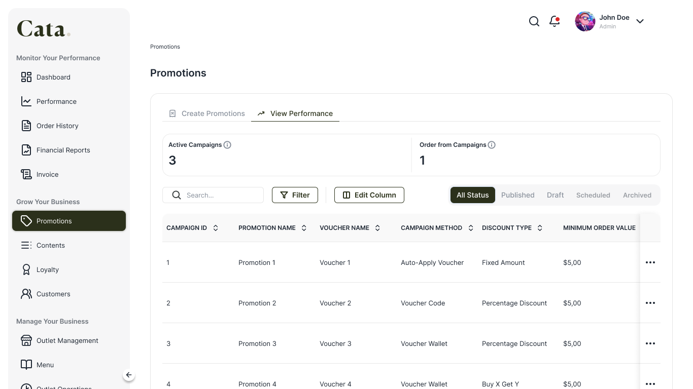
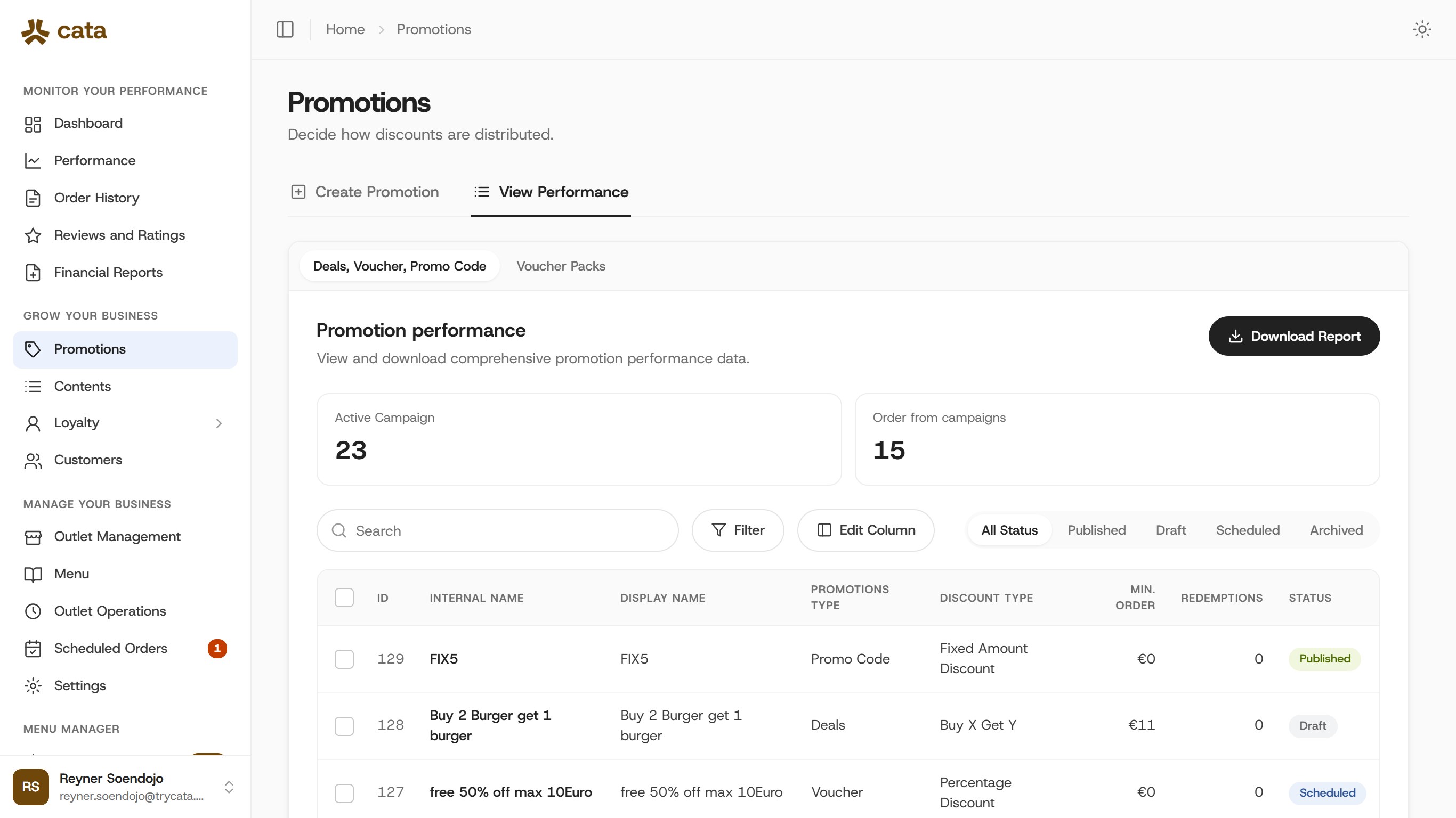 BeforeAfter
Before, the old design in FigmaAfter, designed with the design system Row actions you can always see.
Row actions used to hide past the last column and appear only on hover. Now they stay pinned to the right edge, touch screens included.
Before After The same page, before and after the design system.
The Performance page with the same demo data, March and October 2026.
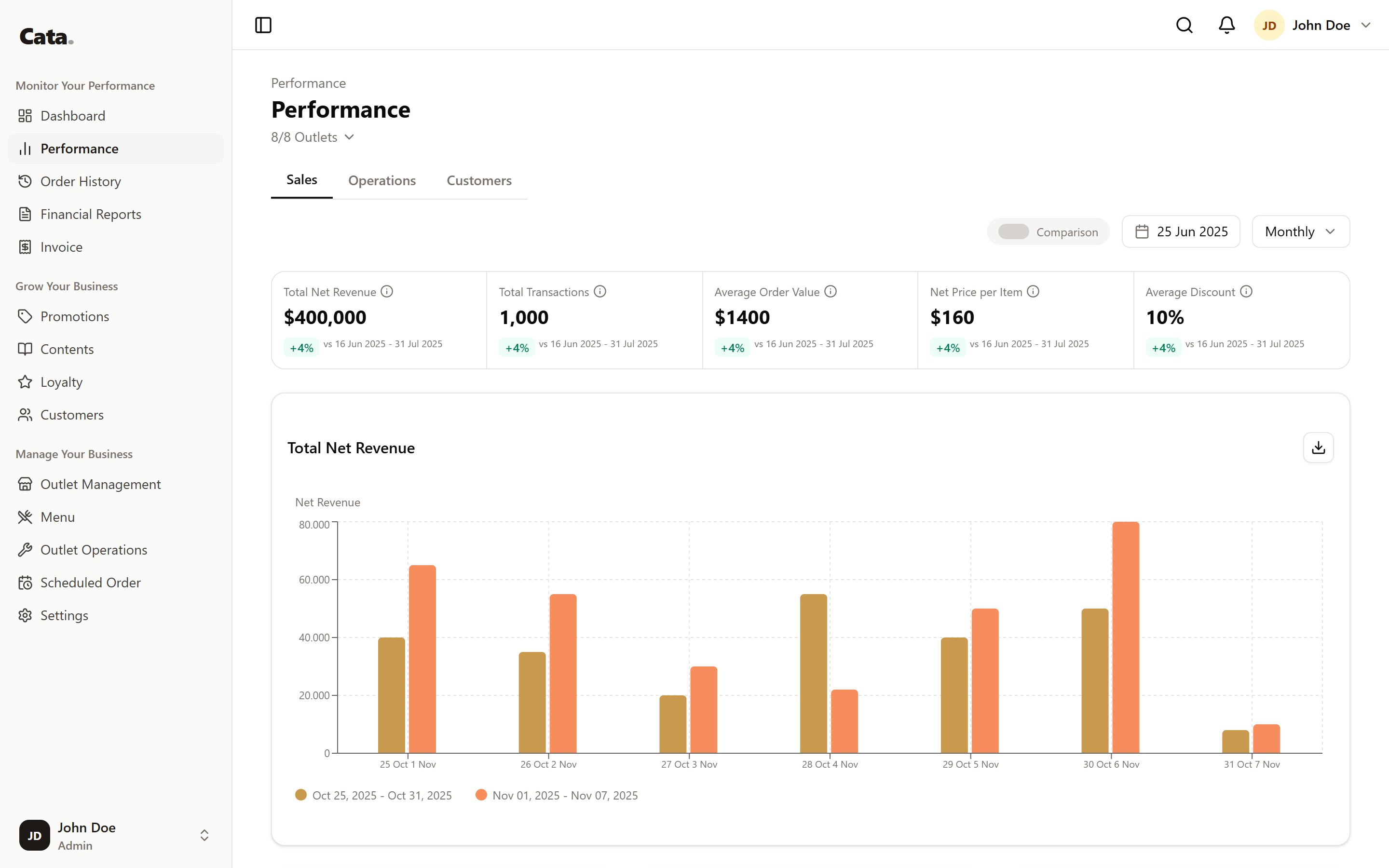
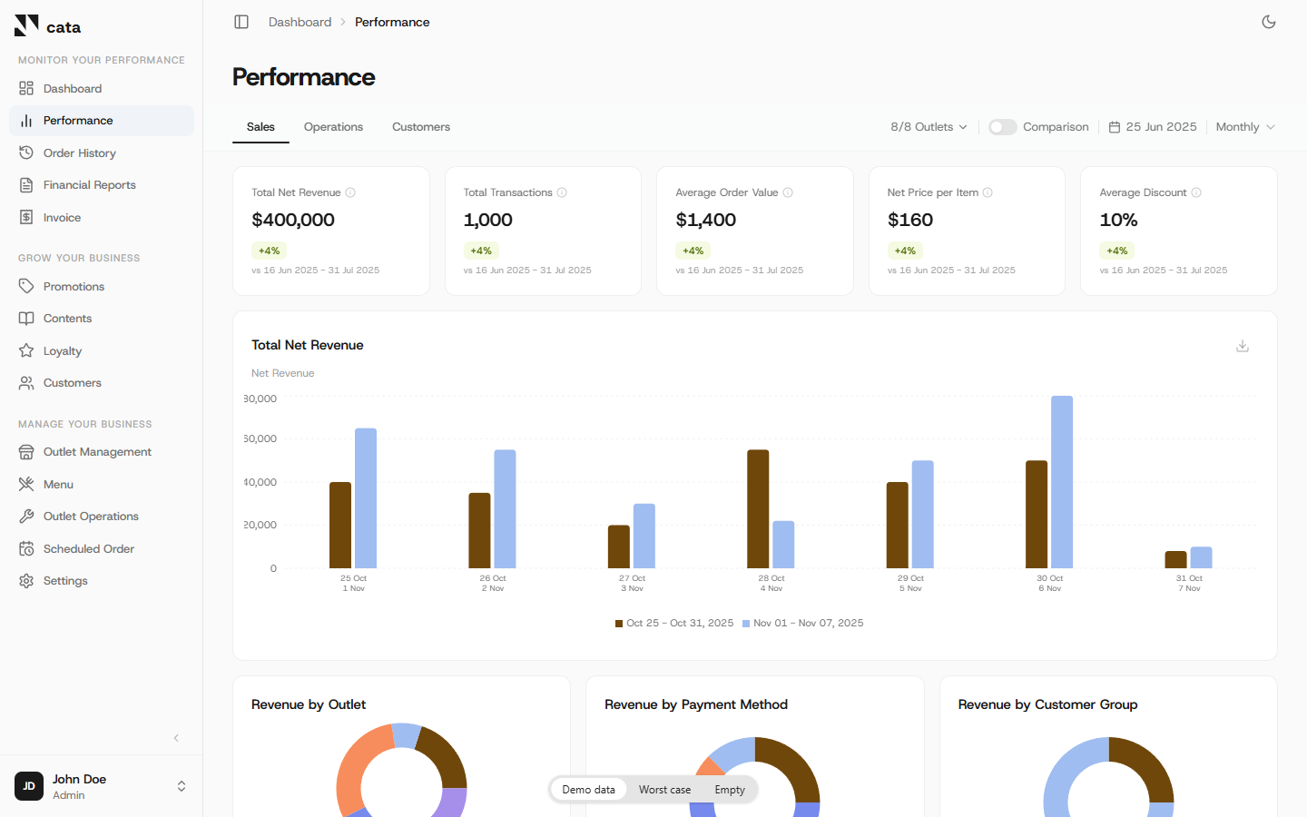 BeforeAfter
March 2026, before the design systemOctober 2026, built from the design system
Key decisions, and why
- Side panel recommended over a full page and a summary view.
- One table style. Rows you can open show an arrow. Rows you cannot open do not react to the mouse.
- Less on screen. A second panel stacked on the first was removed, colour-coded ID labels went, and repeated details were merged.